
Boxie Studios
PROJECT OVERVIEW
Boxie Studios is an independent creative studio that specializes in digital strategy, digital media development, and content. They serve a variety of industries and niches including food and dining, retail and service providers, and community organizations. As a studio, they pride themselves in offering engaging, meaningful, and engagement-driven content that helps brands connect with their audiences. The focus of this job was to design a logo, build out a brand and set the business up for success through social media channels.
Box Studios is a real client
SERVICES
Logo, Branding, Social Media


The Challenge
Boxie Studios is a new and emerging production studio, led by an owner with extensive real-life experience and talent, but with limited platforms to showcase it. Based in the New England region, there are abundant business opportunities to thrive, yet the challenge lies in creating visibility and trust for their work in a competitive market.
The Solution
To address this, we determined that the first step was to establish a strong brand identity with cohesive visuals. Once that foundation was in place, we leveraged the assets from their past projects to enhance their social media presence. We also created a branded social media template kit, designed to make a lasting impact in the community and raise awareness of their studio.
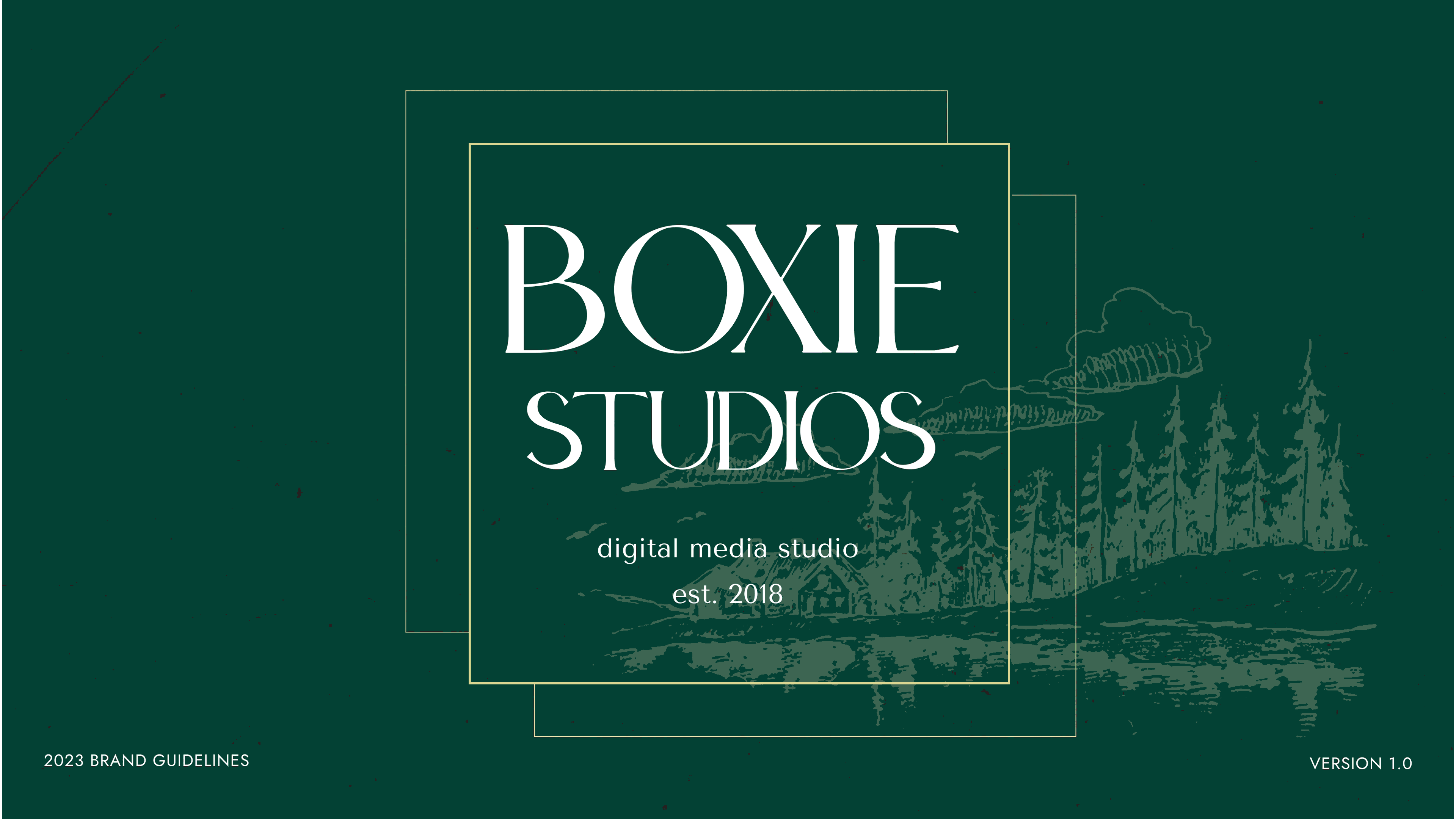
LOGOS
Box Studio collaborates with a wide range of businesses and brands across Connecticut and Rhode Island. The vision for the logo was to create a design that seamlessly integrates with the various brands they work with, reflecting their ability to serve as a cohesive production studio for their clients.
The design aims to capture the essence of Boxie Studios, blending sophistication and playfulness inspired by the East Coast. The fonts chosen reflect the region's vibrant business culture, while the logo appeals to those who share a love for the area and its commitment to local, sustainable resources.

COLOR
The color palette for Boxie's brand was curated to reflect the colors and aesthetic of the costal area. These colors not only resonate with Boxie's business style but also echo the natural beauty captured in the surrounding of New England's coastline where many of the businesses Boxie works with are rooted in.

SOCIAL MEDIA
As part of Boxie's brand development, we created a comprehensive social media kit to help them build their online presence and enhance internal marketing efforts. Our strategy, like that of many studios, focuses on sharing content that is consistent with their brand identity while allowing the work itself to take center stage.
The kit includes curated examples of their work, thought starters to engage clients and viewers, and a variety of customizable templates. This approach not only streamlines their content creation but also encourages consistent engagement and strengthens their connection with the audience.
