Gillian Mattern
PROJECT OVERVIEW
Gillian Mattern is a brand consultant and photographer working with local entrepreneurs and small businesses in South-East Connecticut and beyond. Gillian Mattern assists by providing insight, skills, and support so new business owners can take control of their presence on social media. She helps builds brands with cohesive and unique
brand narratives.
Gillian had come to me to help design her website and build her brand by crafting a logo that embodies her retro and free-spirited soul.
Gillian Mattern is a real client
SERVICES
Branding, Web Design


The Challenge
Gillian wanted a brand that was an extension of her as a photographer and a person. The aesthetic she was inspired by presented a challenge when we started talking about website design. She wanted layers of big and bold elements and something that didn't compete with her work, but also wanted a website that would be easy to navigate and view.
The Solution
To meet Gillian's vision for a brand that authentically reflected her personality and style, we needed to strike a balance between visual impact and usability.
LOGOS
The brand identity for Gillian's main logo was crafted to capture a balance between playfulness and sophistication, representing her personality and appeal to a broad client base. The logo leverages the contrast between serif and sans-serif fonts, a deliberate choice to convey versatility—signifying Gillian's capacity to engage clients across various style preferences, from refined to whimsical.
The floral elements add a layer of warmth and approachability, bridging her fun, exploratory personality with the seriousness of a growing, professional business. This organic touch invites a sense of creativity, subtly suggesting a brand that is both approachable and artistically grounded.
The brand mark was intentionally designed to feel both fun and sophisticated. The serif initials evoke a classic elegance, drawing inspiration from traditional tattoo motifs, refined newspaper typefaces, and a nostalgic, collage-inspired aesthetic. This blend gives the logo a timeless feel while incorporating unique, personal touches that align with Gillian’s brand story.
Overall, the design choices underscore a strategic vision: to position Gillian’s business as both personable and professional, appealing to clients who value creativity grounded in a classic design foundation.

COLOR
The color palette for Gillian’s brand was curated to reflect both her personal style and the emotional tone of her photography. Inspired by her favorite hues and color combinations, the palette aligns with the varied landscapes of New England. These colors not only resonate with Gillian’s personal tastes but also echo the natural beauty captured in her work, creating a seamless connection between her brand identity and photography through her website.
Each color was selected for its ability to evoke warmth and authenticity, ensuring that the palette feels organic and accessible while adding depth to her visual identity. The result is a versatile color scheme that enhances Gillian’s brand personality, grounding it in a sense of place and tying her artistry to the natural, changing hues found in her portfolio.

TYPOGRAPHY
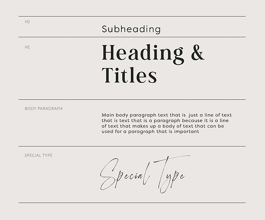
The typography for Gillian’s brand was chosen to reinforce the dual qualities of sophistication and playfulness that define her visual identity. By pairing serif and sans-serif typefaces, the typography complements the logo’s blend of classic and contemporary elements, supporting a brand voice that is both refined and approachable.
After exploration of various typefaces, a traditional approach was selected to enhance the vintage aesthetic that is present in Gillian's photography and website design. This choice creates a cohesive experience across her brand, echoing the nostalgic, timeless qualities in her work and strengthening the connection between her brand identity and her creative vision.

The Takeaway
The brand identity created for Gillian seamlessly blends sophistication with a warm, inviting charm, reflecting her unique style and the emotional depth of her photography. By thoughtfully combining typography, color, and logo design, we crafted a brand that Gillian measures as successful not just for its aesthetic appeal, but for its ability to resonate emotionally with her audience. Her website has become a space that feels like “home”—a place where clients are drawn in by a sense of warmth, nostalgia, and authenticity. This inviting atmosphere has proven impactful, with clients often sharing that they chose to inquire based on the heartfelt connection they felt when visiting her site.
